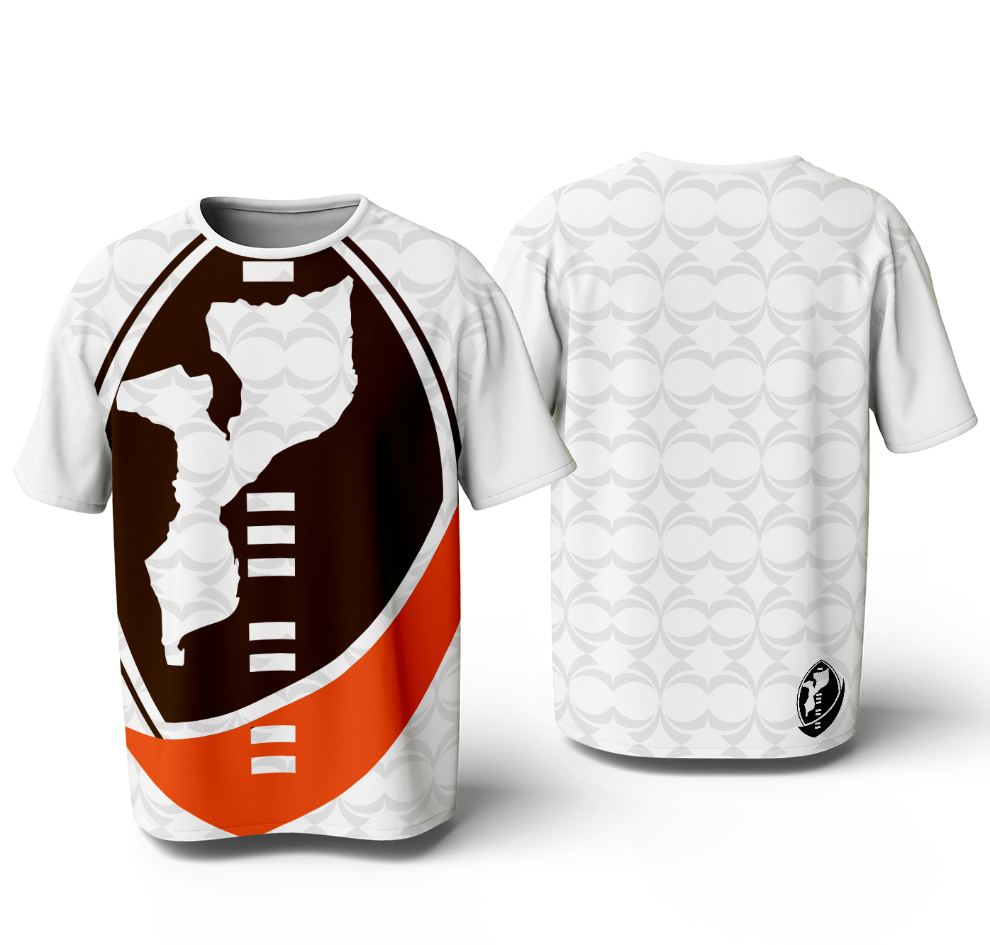
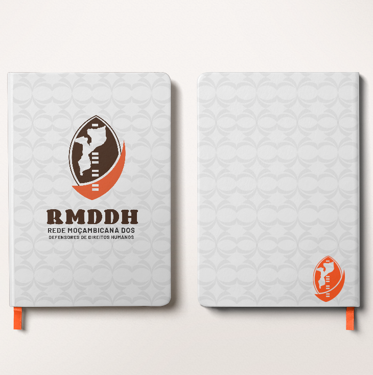
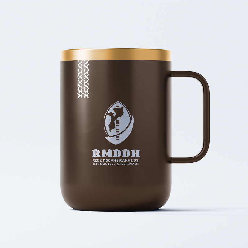
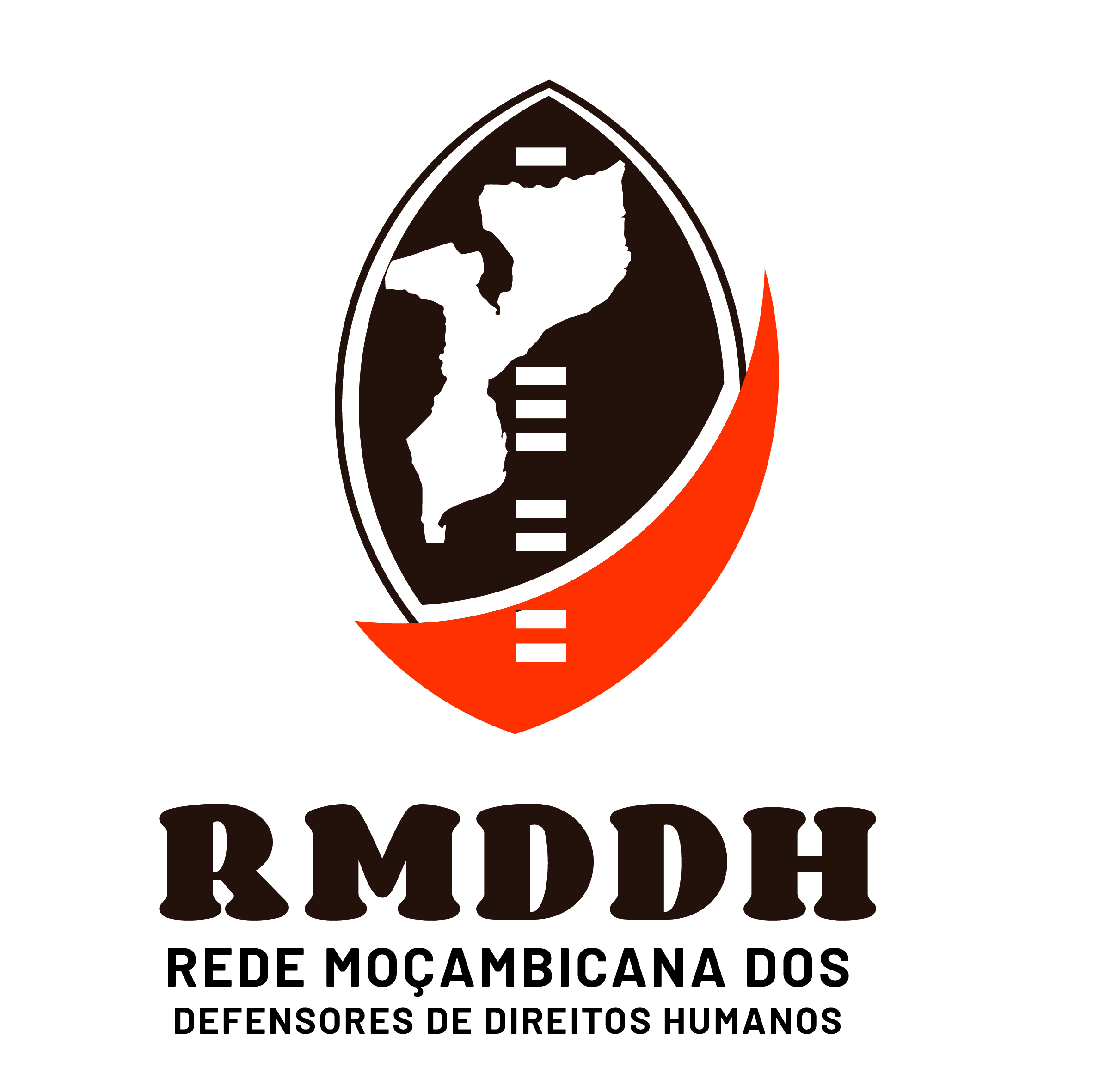
RMDDH - Rede Moçambicana dos Defensores de Direitos Humanos
RMDDH — Redesign With Purpose, Not Reinvention
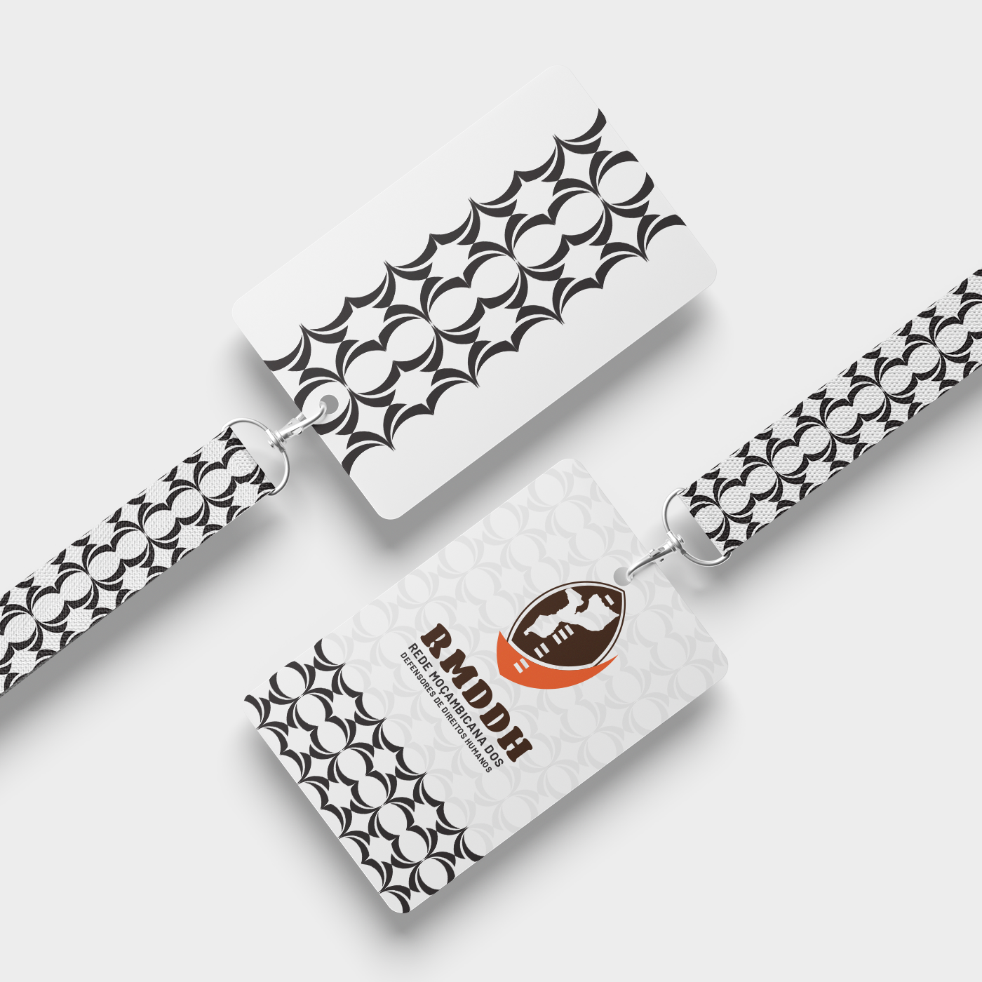
Every logo carries a heartbeat, and the original RMDDH identity was no different. It held strength in its bones – a protective shield, the proud outline of Mozambique, and the warm, earthy tones that echo the very soil the organization protects. The symbolism was powerful, the intention noble.
But even the strongest symbols sometimes whisper for a little alignment, a little balance, a little room to breathe. And that was the quiet challenge hidden beneath the RMDDH mark.
The Problem-A Good Idea That Needed Space to Shine
The original logo housed all the right elements, yet they didn’t dance together in harmony.
The map and shield sat beside each other like two cousins forced into a family photo – close, but not connected.
The color palette was meaningful, but the contrast held back its visibility.
Typography and spacing carried the message, but not with the clarity and confidence an organization of this magnitude deserves.
And some interior details—though thoughtful—were too intricate to survive the journey from billboard to mobile screen.
What Was Already Good-A Strong Soul, A Clear Story
The heart of the logo was never in question.
The shield spoke protection.
The map spoke identity.
The colors spoke home.
RMDDH’s visual story was intact—it simply needed a clearer melody.
The Solution-Refinement With Respect
So I approached the redesign like tuning an already beautiful instrument. The goal was not to change the music, but to sharpen its notes.
Integrated the map and shield seamlessly, allowing symbolism and structure to flow as one united idea.
Enhanced color contrast while preserving the warm, grounded tones—making the logo more readable, more accessible, and more adaptable across all platforms.
Refined the typography and spacing, guiding the eye with balance and intention, giving the composition a more professional and authoritative presence.
Simplified internal details, ensuring clarity and scalability so the logo could stand tall everywhere-from advocacy documents to digital platforms.
The Outcome-Evolution Without Losing Roots
The refined version doesn’t replace the original story-it amplifies it. It brings harmony where there was tension, clarity where there was clutter, and confidence where there was hesitation.
Because great brand design doesn’t always demand revolution. Sometimes, it simply needs a steady hand, a thoughtful eye, and the courage to polish what already works.
RMDDH’s refreshed logo stands as a reminder: